Designers around the world are addressing challenges during the COVID-19 pandemic in some amazing ways. I have been interviewing some of these designers to share their stories with you.
For the first post, I had the opportunity to interview Victoria Aboud, one of the designers working with a large team of data scientists and researchers at IBM on IBM’s Covid-19 Dashboard.
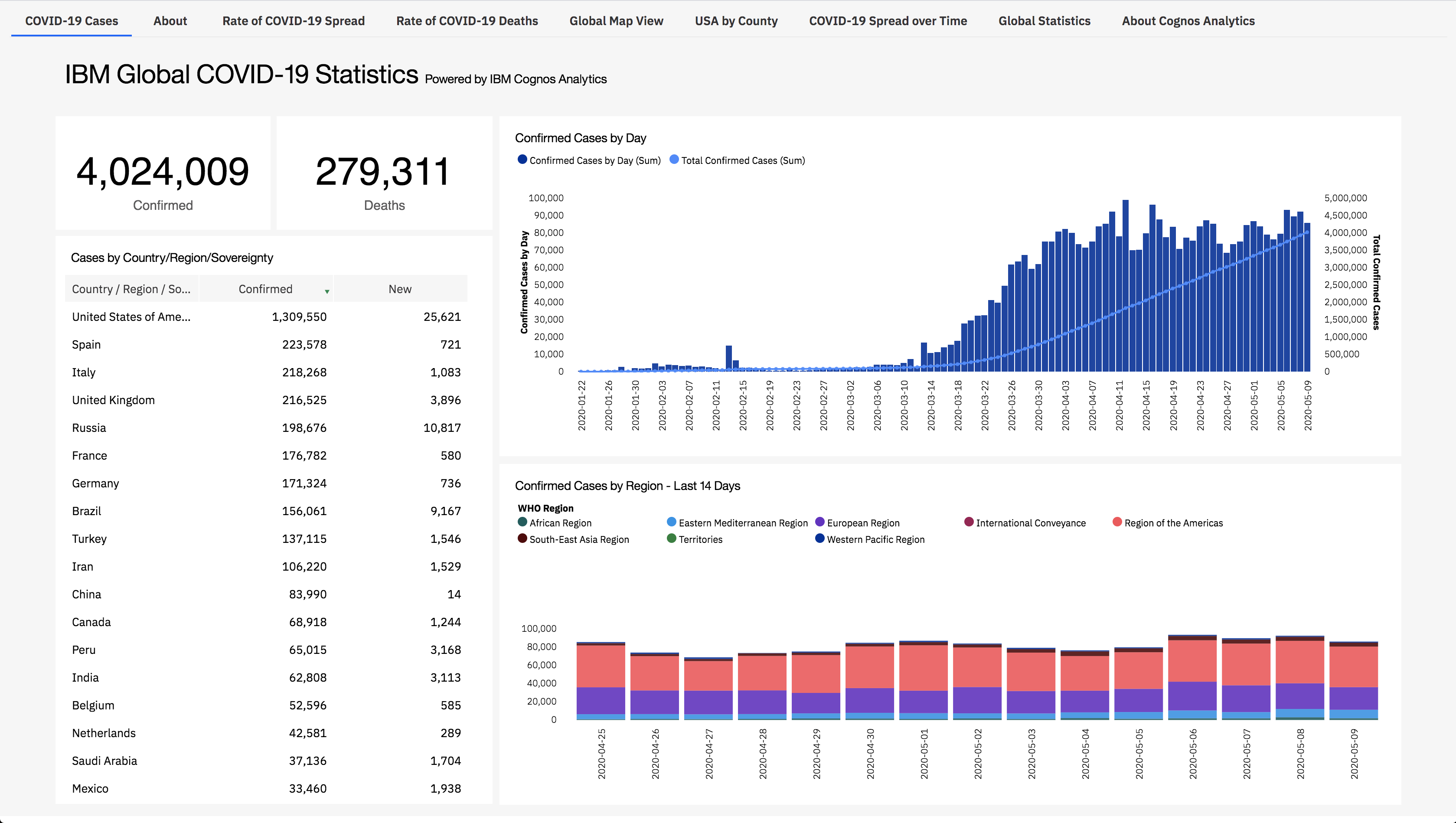
Image credit: IBM (IBM’s Covid-19 Dashboard date accessed May 11, 2020)
During this challenging time of the Novel Coronavirus outbreak, IBM is providing the public a free and interactive tool to track reported COVID-19 cases. Currently, the dashboard offers trend graphs in the U.S. to view recent statistics down to county level, it also offers global data of number of new cases and deaths, including comparative trend graphs between the countries. Additional information such as available public health information, patient education materials, locations of key healthcare clinics and testing centers and more, are anticipated to be added as available (Source IBM Newsroom)
Victoria Aboud has been a UX designer and user researcher at IBM for ~5 years. Prior to joining IBM, Victoria was a UX designer and strategist at several other design consultancies.
What is your role in this project?
Within this project, I am a designer and have been working with another researcher. I did not initiate the project, but collaborated with a group of data scientists who work with data analytics software. We are trying to give people the information that people are looking for and make sure that information is accurate. We are adding more information to the dashboard, with a visual hierarchy, and users can expect more information based on what we can gather. Our data science team is putting as much as they can, making sure it’s accurate and very reliable.
How is your team facilitating this process?
We did a survey with about 400 people asking what information they are looking for around COVID-19. Based on the answers, we prioritized what kind of charts we shared. l. We are also presenting it so that it is consumable – that’s where my role comes in – I am trying to shape the dashboard so it makes sense and tells the story that’s usable. Using the data we have and the data people want, I put it all together.
What was your motivation to work on a project like this?
I took some time out from my regular workload because I thought this was a project which could potentially do some good. It’s always good to work on a project that makes a difference. I think it is worthwhile to provide one more source of good information and it can’t hurt.
What advice do you have for young designers and design researchers out there?
Follow up on how people are using your research rather than just putting it out there and then abandoning it. It’s nice to see if people are actively using it, reminding them of what the research found to make sure that it guides the design. Follow up and follow through on new recommendations and how it’s affecting the design.
For more information about IBM efforts around COVID-19, visit https://www.ibm.com/covid19 and https://newsroom.ibm.com/covid-19